2015 Pantone Color of the Year
How to Work with Pantone’s Color of the Year
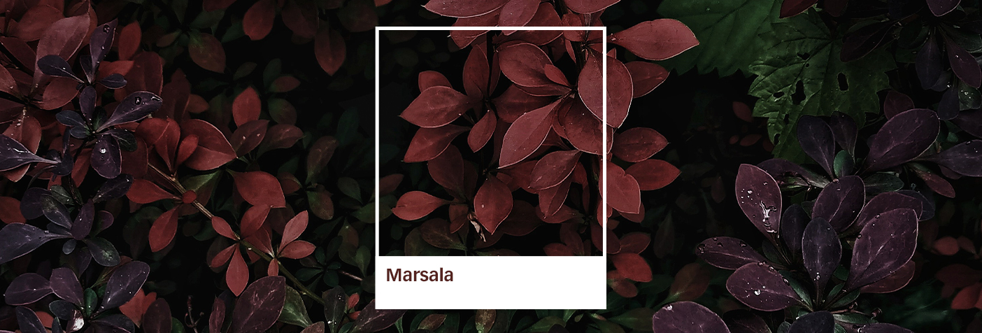
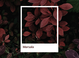
Marsala—a.k.a. Pantone’s Color of the Year for 2015—is the embodiment of all this year’s outdoor furniture trends, conveniently packaged into one tasty color:
- It’s a trendy choice for interior spaces, and for bringing the indoors outside
- It’s a warm, rich shade that pairs beautifully with a variety of woods
- Its sophisticated earthiness unifies an assortment of colors, textures and patterns
Whether you’re going for high drama or subtle stylishness, you can make Marsala work with your outdoor décor. Here are a few color palettes provided by Pantone that show just how versatile the color can be:

Marsala adds a bold contrast of color, providing depth and warmth to this modern, gray-violet palette.

This warm floral palette becomes more grounded and embracing with the addition of Marsala.

Marsala steers the warm, neutral colors in this palette towards the earth, creating a relaxing mauve palette.

Marsala is a unifying element in this grouping, marrying the taupe, lavender and neutral gray hues to create a unique look.

Adding Marsala to this palette makes a sophisticated statement. It’s a bold, balancing addition that ties in the warmness of Apricot Brandy and dark earth tone of Tapenade.

Marsala adds an unexpected punch of color to this palette, balancing out the vibrancy of Cress Green while complementing the mustard/ochre gradations.

Marsala warms up this otherwise cool grouping, creating a well-balanced Mediterranean palette.
Banner Credit: www.bestdesignprojects.com